Building a Leading Consumer Digital Bank
With a robust asset base of approximately $42 billion, Valley Bank, a regional entity, operates over 230 branches catering to both personal and commercial customers. As the bank experienced continuous growth, attracting an increasing number of customers daily, the leadership team recognized the necessity to create a seamless digital onboarding experience.
Within 90 days, $10M+ in account openings with a 3X lift in funnel conversion for new digital bank and onboarding experience, valleydirect.com. Decreased application completion from 20 to sub 5 mins via design, new API’s, auto-decisioning (KYC) and instant bank verification.
Challenge
As the business grew, the role of design became paramount providing innovative solutions to effectively manage this expanding customer base and optimize business operations.
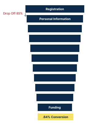
With a 85 percent drop off following the first page of the online application to open an account, it was an obvious priority. A lean cross-functional product team was asked to redesign and re-platform the experience, delivering the first release in 90 days.
Solution
The team re-platformed and redesigned the account opening experience using operational and behavioral metrics to guide optimizations. The team also introduced new technologies that increased straight through processing of applications, decreasing costs and increasing conversions.
After the first six months of the relaunched experience, success metrics were:
- Reduced annual customer care costs by $88,200.
- Reduced the number of manually-processed online banking applications by 50%.
- Increased account opening conversions by 10x.
- Reduced the length of time required to open an account online from 20 to 5 minutes.
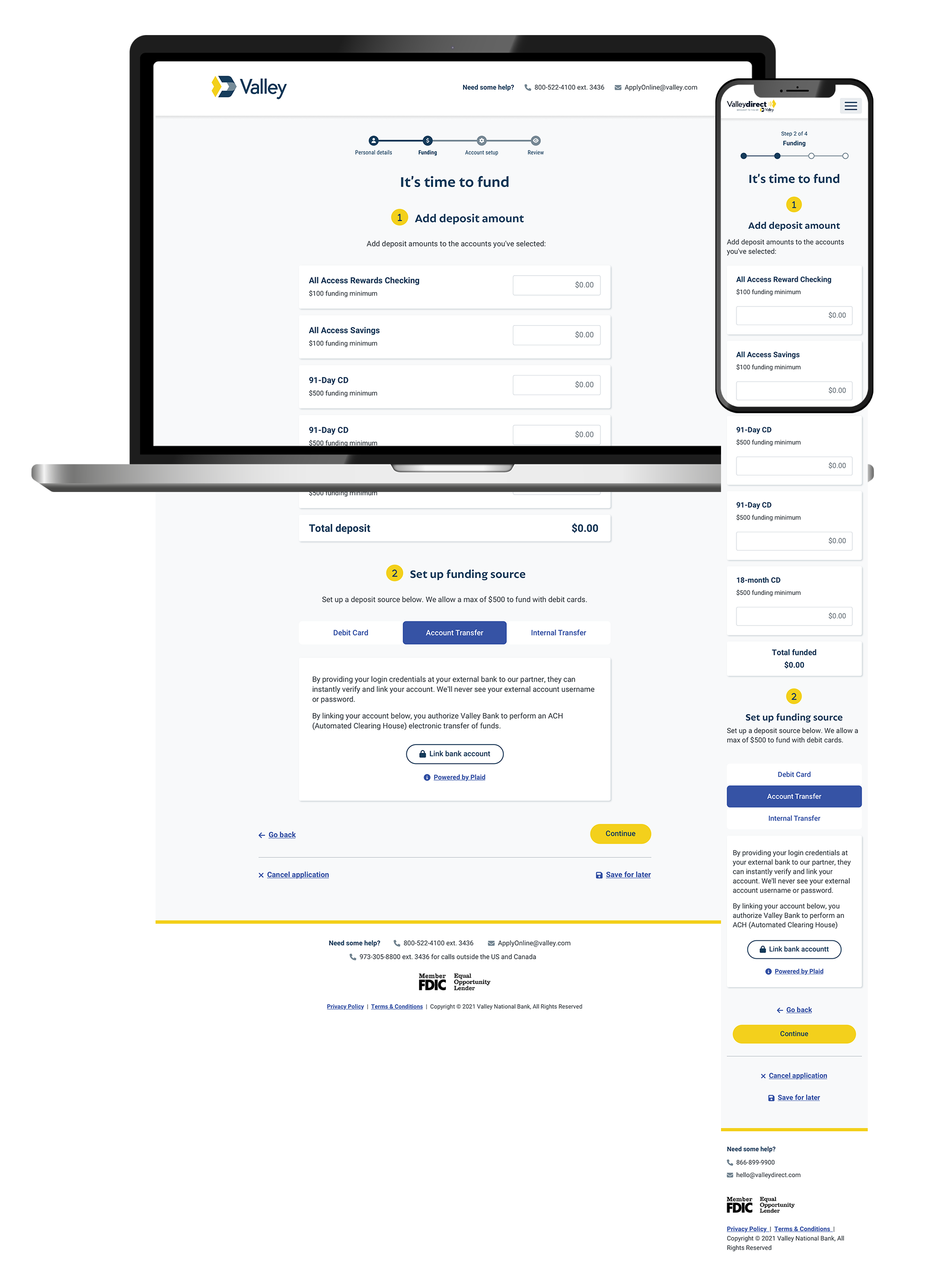
We created an experience that was simple, reducing the number of steps and simplifying the overall experience. It feels and looks visually lighter.
We created an experience that was guided, with the use of input field hints, progressive labelling and tool tips to help the customers complete tasks.
We created an experience that was friendly, using natural language to ensure the customers feel at ease and validations and expectations are met - at a human level.
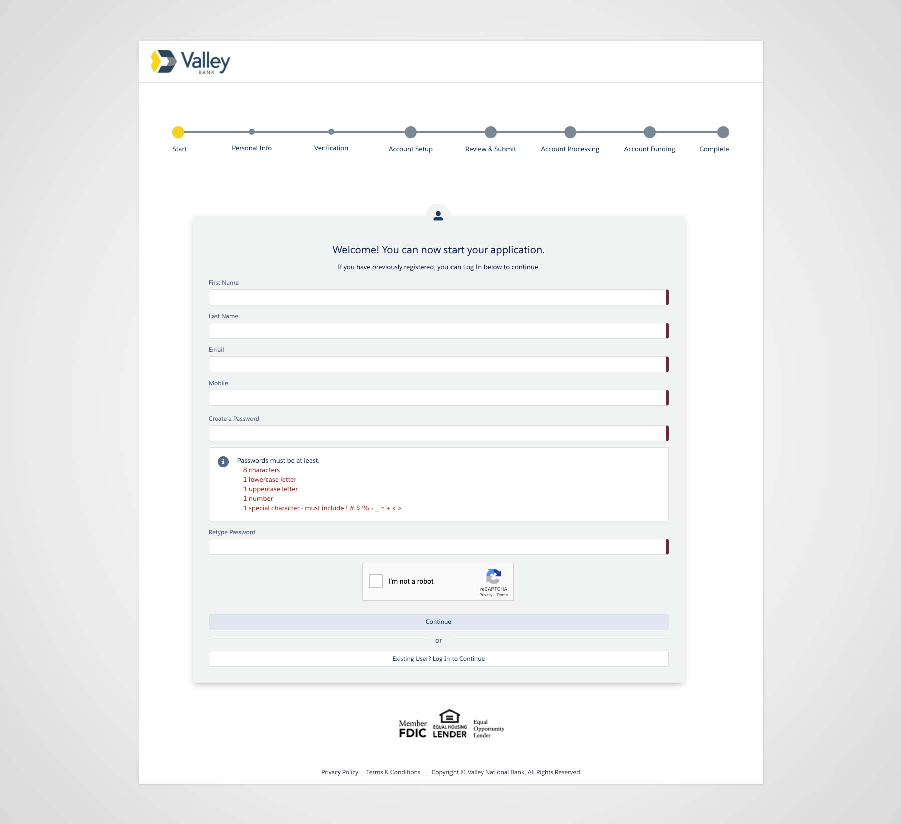
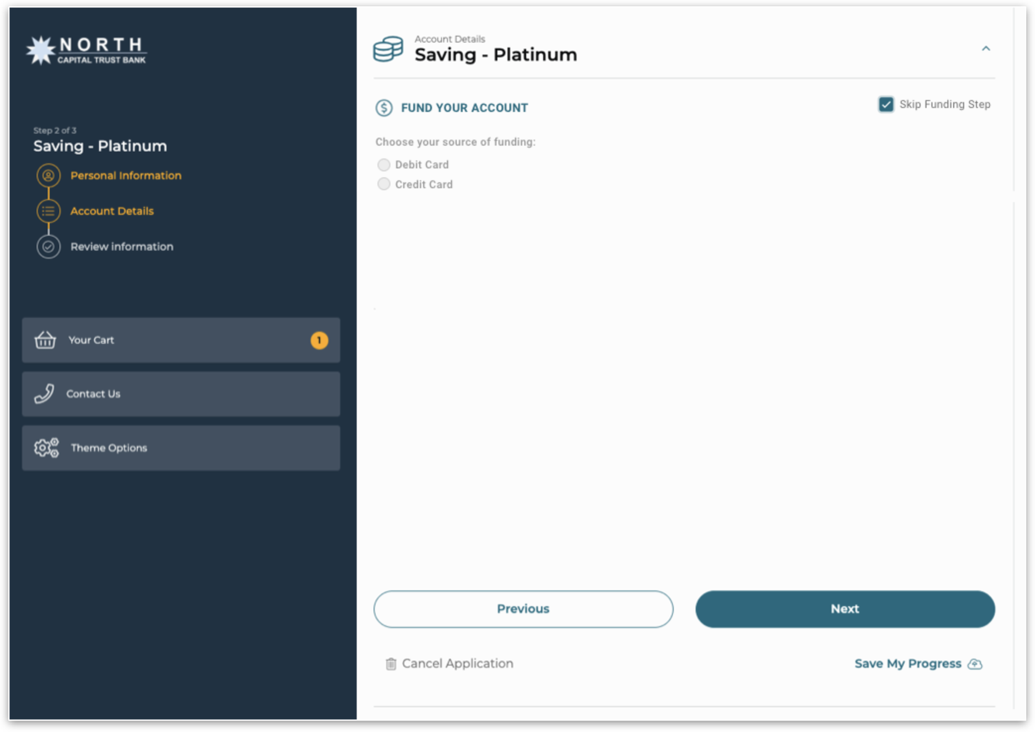
The old account opening experience:
Show, Don't Tell
We were hugely successful in convincing the CPO we needed to customize the frontend of the third party account opening solution by conducting A/B testing of the out of the box solution and creating a vision prototype then presenting evidence to the CPO.
Some Signal is Enough Sometimes
One of the ways we hoped to cut on application completion time and abandoned sessions was by using a third party to help us make the initial deposit process more seamless. However, we had a hypothesis that people would be uncomfortable using this method because the lead had to provide their banking credentials for it to work. We knew there was risk here because of perceived trust and security issues. This held true once we went live. The team worked to provide alternative paths as a fast follow, including adding back the longer path to funding that increased time to complete.
Mobile First, Even for Complex Account Opening
We didn’t spend enough time testing mobile and ended up with usability issues at launch and the team had to balance feature development with usability improvements.
Approach
As the Head of Design, my role was pivotal in streamlining the account opening process, which was identified by the leadership team as a time-consuming task. The design team took the initiative to pinpoint the friction points in the user experience across both digital and physical channels. Collaborating closely with the development team, we redesigned the experience to enhance conversions.
Our user-centered design challenge:
How might we create a frictionless multi-channel, multi-product onboarding experience?
Discovery
After understanding the business requirements, the team conducted a heuristic analysis along with mapping fields to business requirements so that we understood what was required versus nice to have.
Why? In this case, there were two obvious reasons conversion was low.
It took 20 minutes to complete the application with 12 steps.
Completing a lengthy account creation form was required to even get past go. There was a 85% drop off at the account creation page.
For this project, we were given a third-party solution as a starting point.
Leadership recommended the team launch with the frontend solution provided. Our cross-functional team strongly felt we could do better.
We conducted usability testing of the out of box solution and communicated findings.
We spoke to the engineering team to determine how expensive our recommended modifications would be.
We presented our findings, recommendations and estimates to leadership.
By showing, not telling leadership, leadership agreed to onboard an additional resource, a full-time UX Designer, to create a new design system for account opening and focus exclusively on the experience.
This dramatically changed the outcome of the work.
The associate experience backstage also suffered.
Valley associates touch 94.5 percent of customer applications for online banking. The risk tolerance was low for straight-through processing AND the right technology solutions were not in place.
Design
The team adopted a test, learn and iterate approach. The final MVP design evolved based on insights discovered during research sessions.
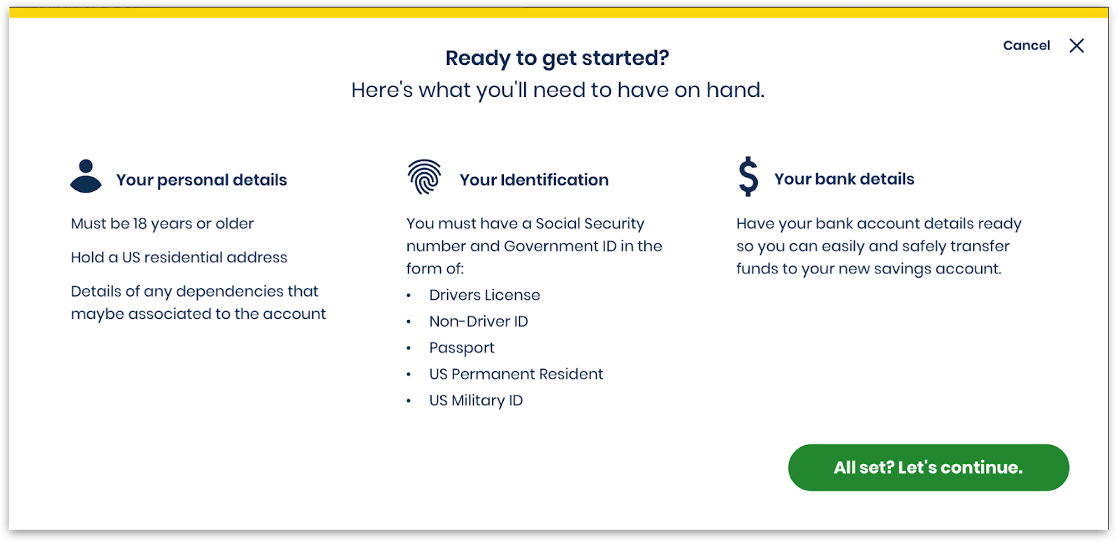
People need clear information upfront about what they need to complete the application in one session.
So, we added this information after a user clicks “apply now.”
- As a UI best practice, this sets the expectations before the user enters the form and creates an experience of openness and honesty
- Overall (60%) this screen was welcomed and people appreciated why it was there and the expectations it set.
80% of users expected navigation and progress signals to be top center. This also supported mobile friendly views.
- 80% of users had a preference and expectation for navigation bar on top
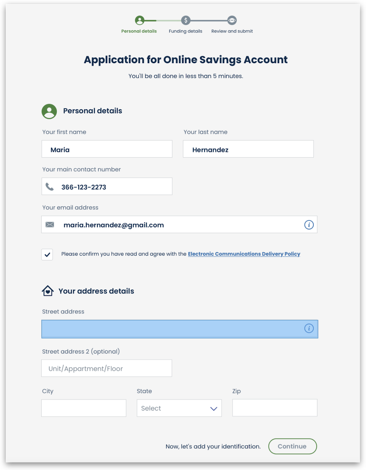
All personal details were entered on one page, using interactions that created a sense of focus and progression without visual noise.
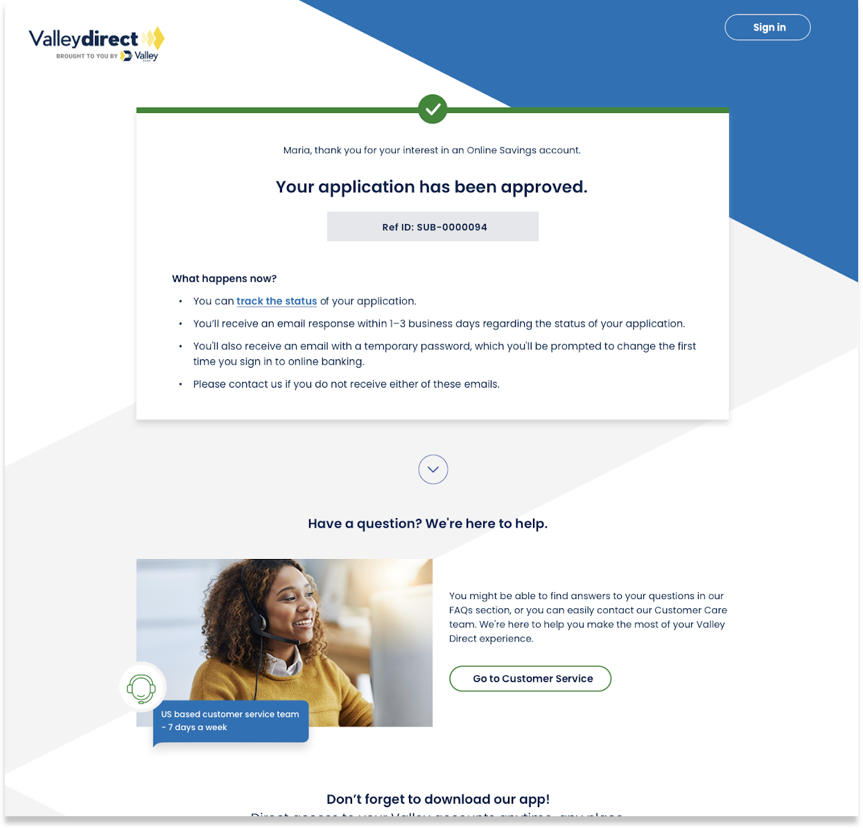
Online banking setup was moved into the account opening flow and information on next steps was refined on the confirmation page.
- 50% expected an account to be instantly approved, 50% expected a review
- A confirmation or reference ID# was widely expected along with an email
- 50% of users wanted a timeline, and felt that asking for them to create an online banking username after an account was confusing
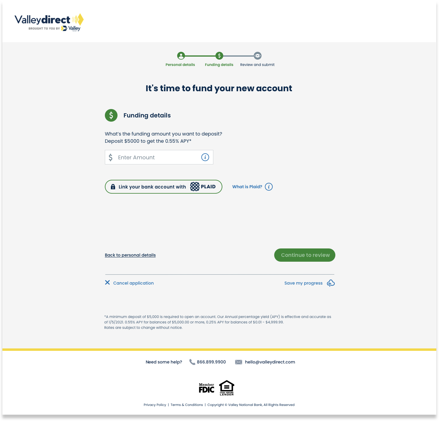
Funding with Plaid was one of the most complex areas. It was being pitched as a magic wand by the business due to the promise of instant funding of accounts, which also meant instant transfers of deposits to Valley.
More deposits was one of the key indicators of success.
- Participants familiar with Plaid easily completed the step with no obstacles
- Participants unfamiliar with Plaid want to fully understand Plaid functionality and feel that their information is secure.
After launch, analytics showed us our hypothesis that Plaid could impact conversions was correct.
However, it was for usability and technical reasons.
One of the first fast follows was to remove pain points created by Plaid. This actually meant reverting back to the previous method of funding with micro deposits that delay the opening process.
Team
Caroline Phillips, Product Designer
Brandon Mosley, Product Designer*
Michelle Ammiratt, UX Researcher
Joel Rosado, UX Researcher
Laura Cochran, Design Director
* Please visit Brandon Mosley's portfolio to see the latest product design work.
View More Case Studies