FinTech: Mobile App Redesign
Northwestern Mutual (NM) is well known for its insurance products. Its client-facing web and mobile applications allow customers to seamlessly make payments, view statements and keep updated on the value of their insurance policies.
As NM diversifies its core products and pushes to grow its business, NM believes it'll be important to better communicate its protect and prosper value prop, as well as, increase client engagement between advisor check-ins.
This work reflects the role NM's digital channels play in helping NM reach these goals. The first workstream was focused on illustrating an ideal mobile experience for the Northwestern Mutual mobile app that could be pragmatically implemented within 2-3 years. The second workstream was focused on iterative delivery of detailed design, working towards the ideal experience.
Challenge
- Objective One: Elevate the design, informing the evolution of the mobile design system, incorporate the NM brand aesthetic and build trust with the client.
- Objective Two: Unite disparate stakeholder visions into a cohesive approach for the client mobile experience. Incorporate the business, advisor, client and marketing expectations into a unified view of the complete client mobile experience.
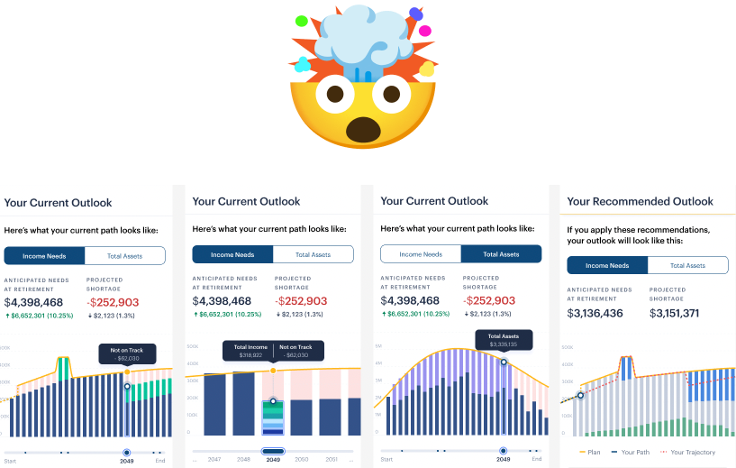
- Objective Three: Envision how the PDF plan can evolve into an interactive experience in the mobile app that allows clients to better understand their financial outlook and play with how life events can impact it.
- Objective Four: Deliver hypothesis-driven experiments and iterate the experience based on growth in key metrics: # monthly active users, # multi-product households and the # of users with a Northwestern Mutual plan.
How might we help clients protect and prosper by enabling them to interact with and optimize their plan, review their products, and engage their advisor?
Who did we design for?

- Burgeoning Affluent Clients
- Mid-30’s to mid-40’s
- Owns one or more NM products (risk-only, investment-only, or integrated)
- Has an advisor and a plan
- Married with 1-3 kids
- $125,000 avg. household income
Were there any plot twists?
We needed to understand, then visually communicate dense financial information and accurately nail the technical nuances.
This, but make it a website...
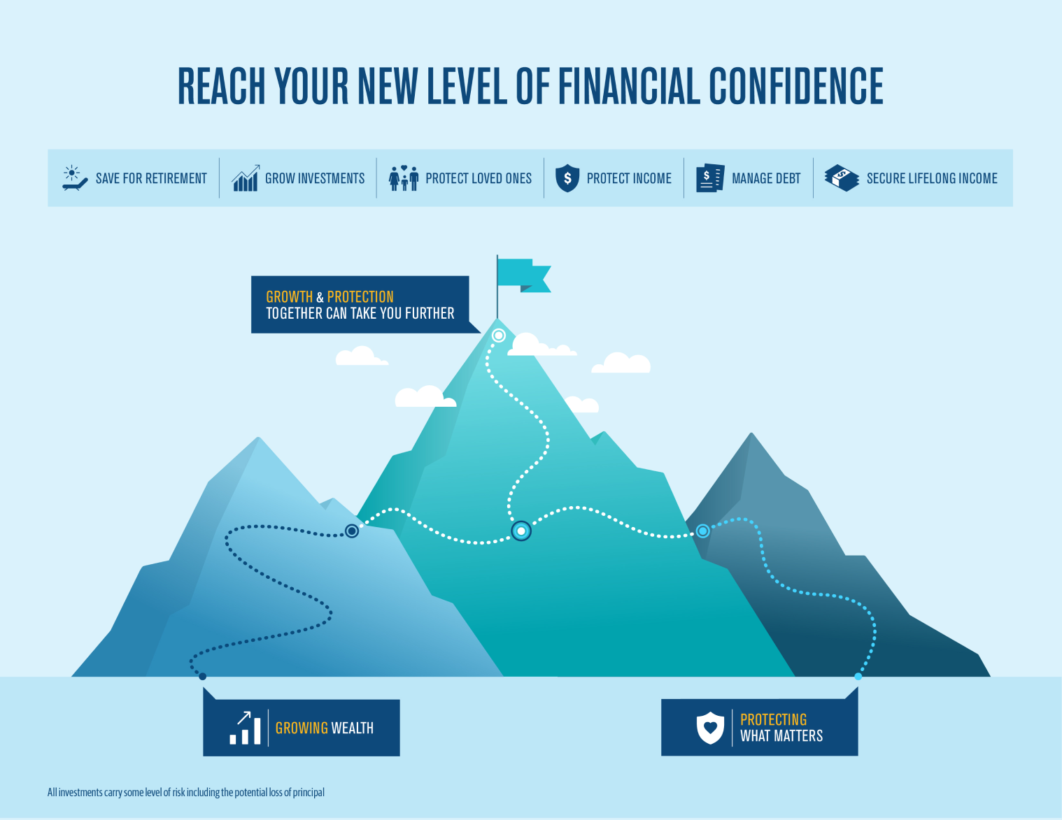
What users were doing and saying diverged from the business needs. This presented an opportunity for the team to consider user and business needs and the complexity of satisfying both.
Help the business grow and help users make payments...
The work was high profile with heavy-handed senior leadership oversight. So, designers were working with different levels of fidelity to get actionable feedback from senior leadership, users and the field (advisors) while they moved fast to deliver concepts.
Solution
As of March 2024 there was a 20.3% increase in MAU YoY and 6.48 average sessions per month a 7.1% positive change MoM.
Elevated Design: Design Language Updates
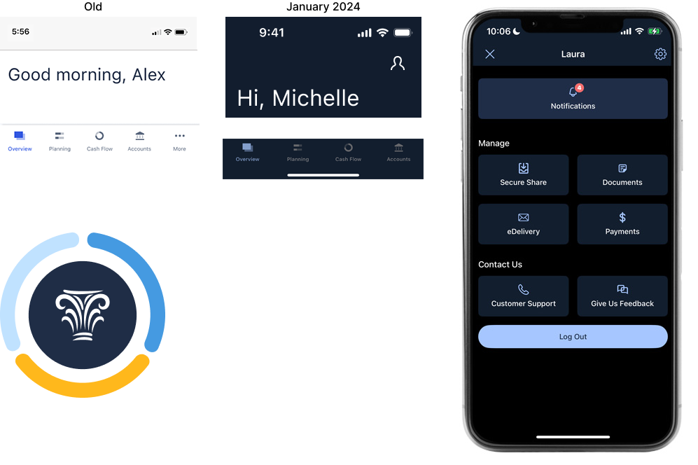
We introduced aspects of Northwestern Mutual's brand aesthetic into the mobile app.
- Brought in the dark NM blue globally with a heavy impact update to the header and footer.
- Introduced NM’s gold highlight color strategically to bring in more of NM”s familiar brand color.
- Created a “NM badge” to illustrate the NM three-part value proposition: protect, prosper, plan; and, provide a simple, intuitive visual for advisors to use to coach clients to "complete the rings" by getting a plan, protection through insurance and an investment portfolio.
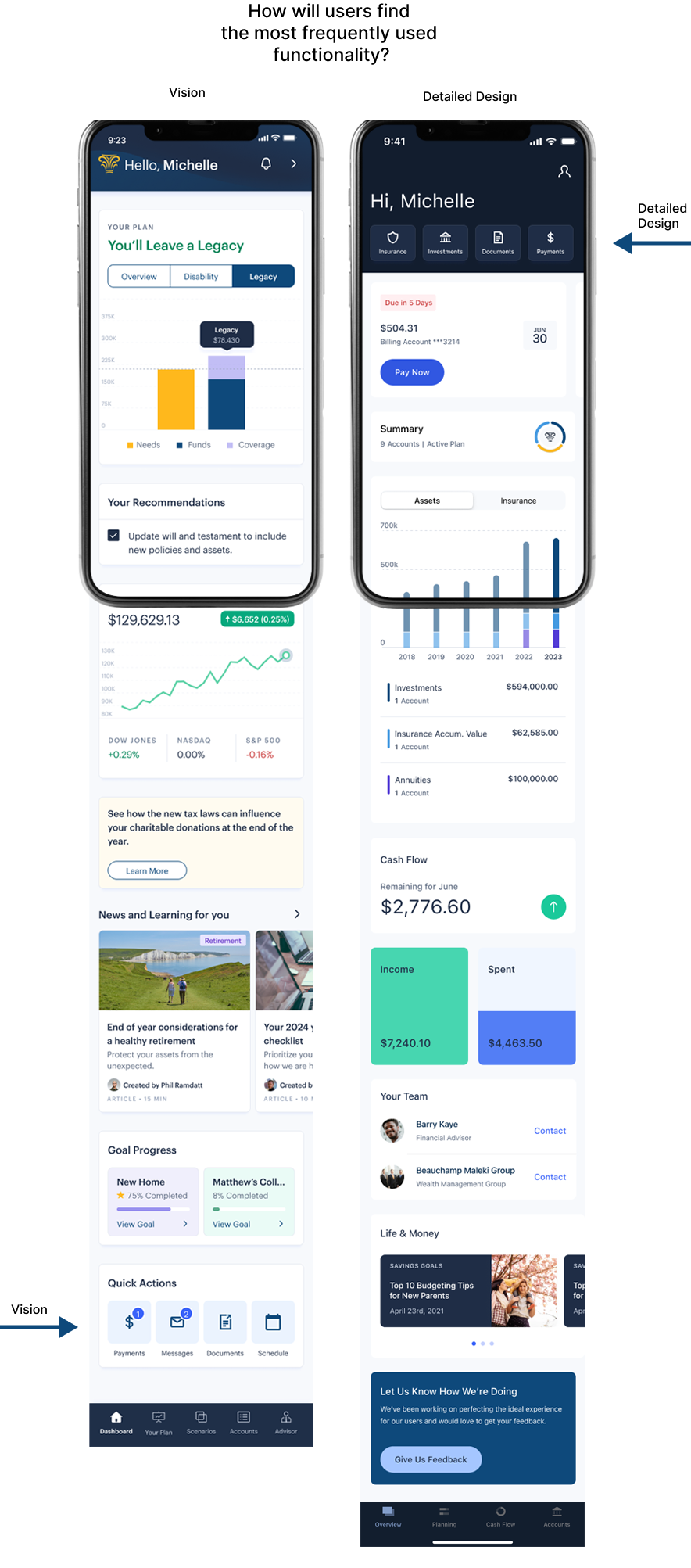
Redesigned Home Hero Module & Quick Actions
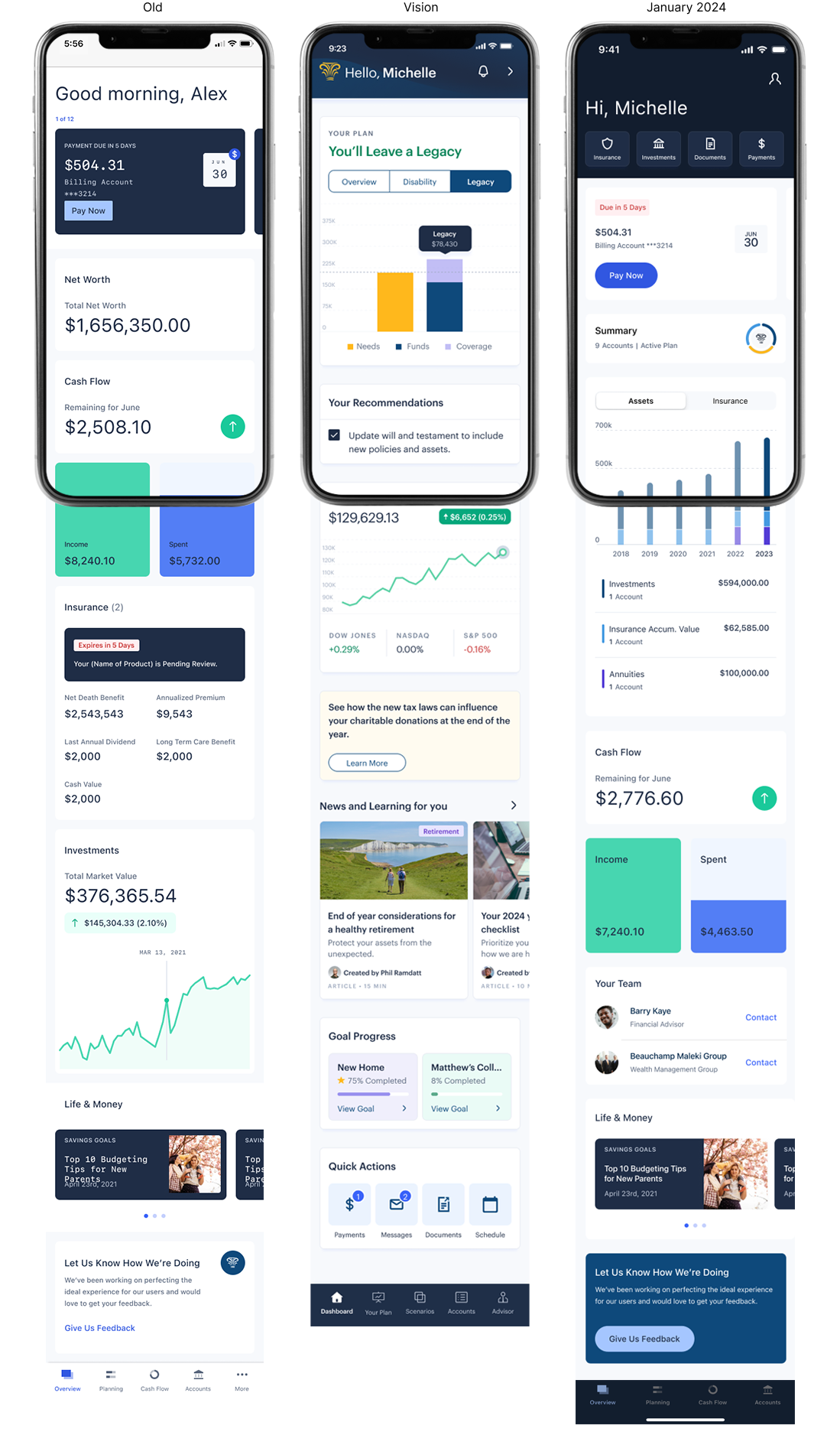
We showed the value of client's products as well as personalized recommendations to expand their portfolio without compromising client's access to self-service capabilities.
- A vision for the redesigned hero module informed the final delivery
- The first version of the hero module launched January 2024, illustrating the value of a person’s NM products
- Quick Actions also launched January 2024, providing one click access to the most used self service items
Communication Center for Advisors & Clients
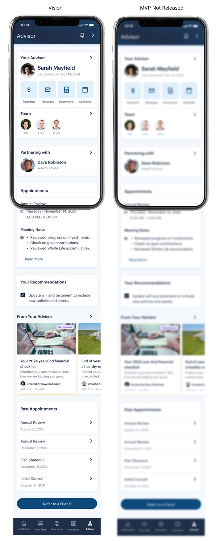
We gave all collaboration tools and advisor communication a "home" to empower clients to seamlessly collaborate with their advisor and financial team.
Approach


What helped create alignment?
- All together, six features were identified from the vision to move to the delivery workstream the first delivery cycles
- Key features & capabilities, a communication schedule, a lead designer and timelines were detailed in a design brief used by the full delivery team as well as senior leadership
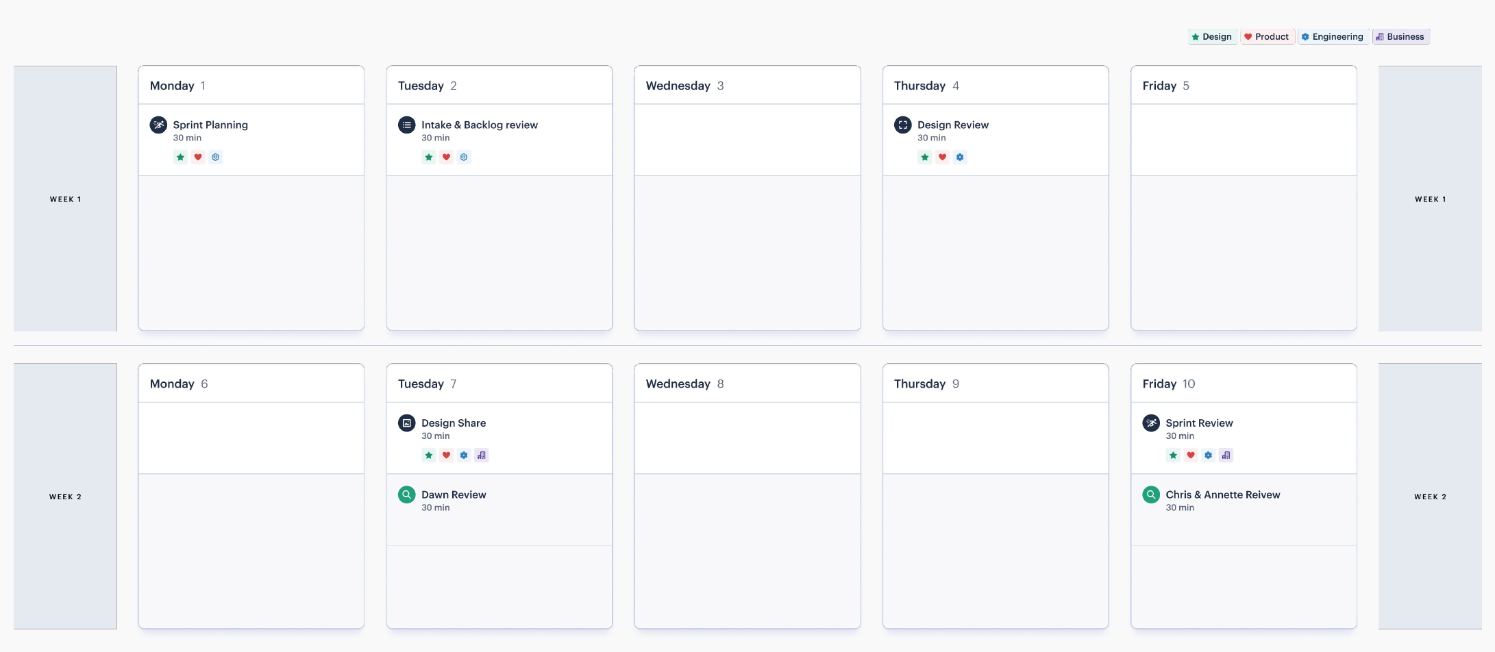
- Design crits with stakeholders gave just in time feedback so the team could keep iterating while staying within the timeline
What helped unblock the team?
- Additional resources were added to fill in technical gaps, such as data visualization and marketing copywriting
- A Slack group with SME's along with a biweekly meeting gave designers immediate access to product experts
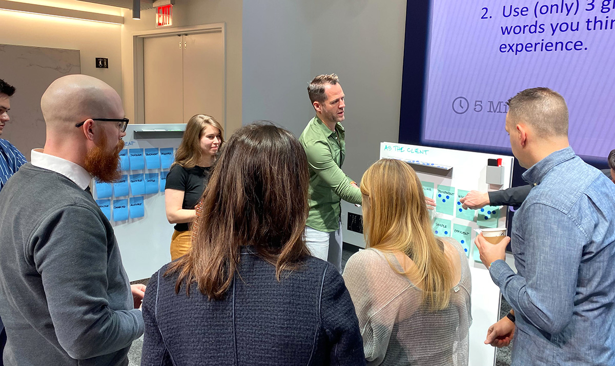
Problem Framing
Both workstreams conducted discovery to inform their approach with the vision team focused on how to shape and frame the opportunities. The delivery workstream focused on refining the job statements from the vision team and iterating on the solutions.
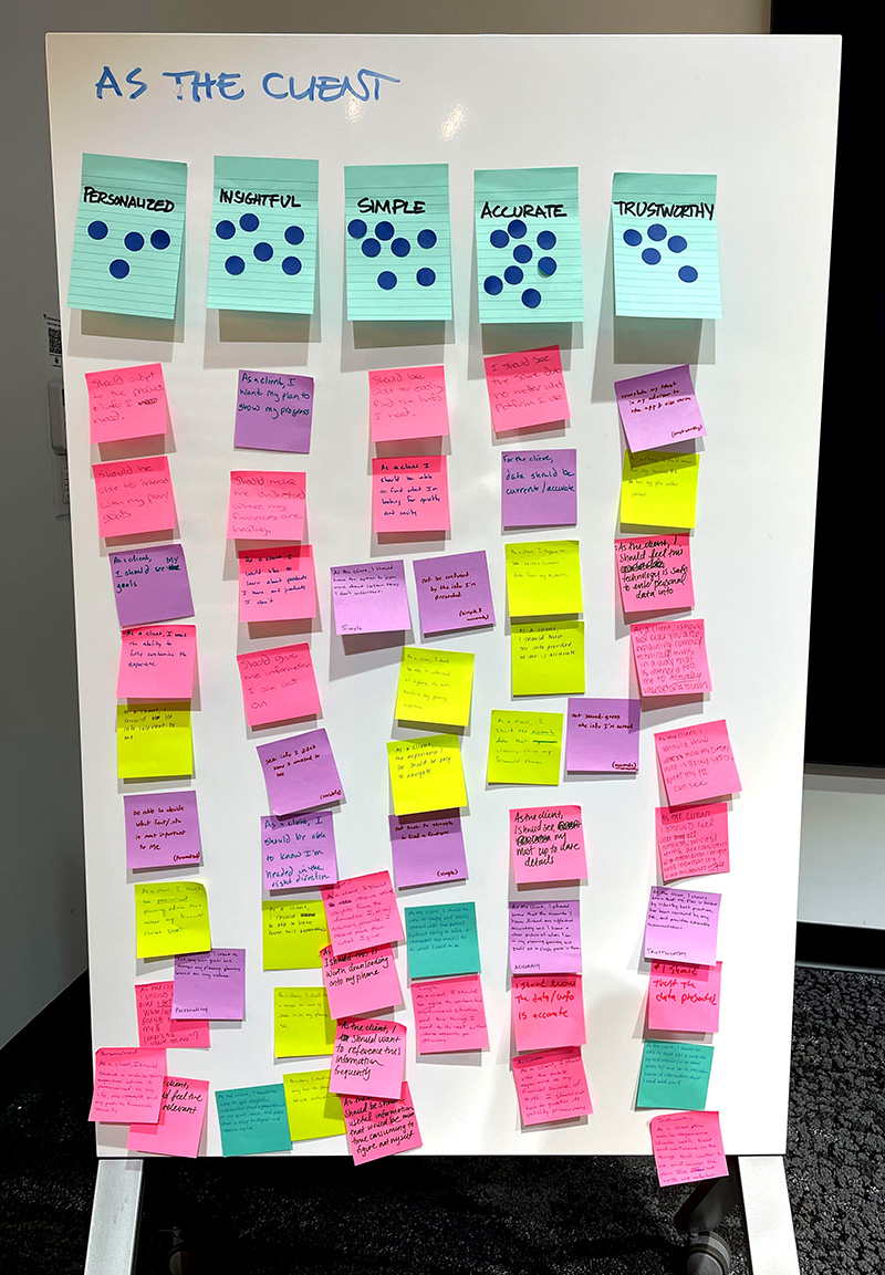
Other Problem Framing Activities:
- Stakeholder Interviews
- Scope Clarity
- Research Review
- Define knows and unknowns about the needs
- Define job stories
- Competitive Analysis
- Current State Audit
- OKR definition
- Target User definition
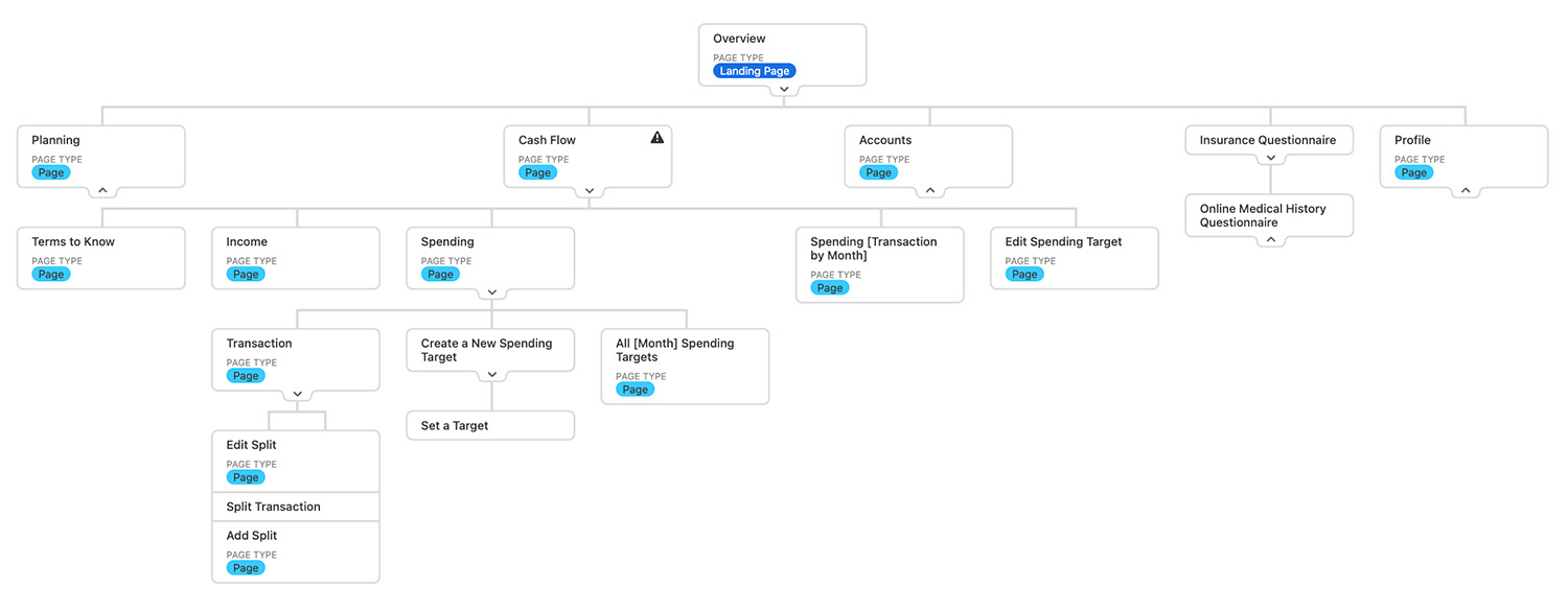
One of the proposed changes to the information architecture was to make the Advisor Center a first-class citizen. This proposed change included removing "Cash Flow," one of the most popular features, to being a second-class citizen. The delivery team used analytics to show how this change would impact usage, including engagement metrics.
Ideate Solutions
During the initial ideation phase, the team sketched solutions, keeping fidelity low.
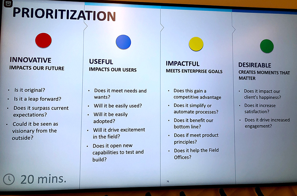
Low-fidelity sketching allowed the team to get out as many ideas as possible. Then, the prioritization framework was used to narrow down and combine ideas.
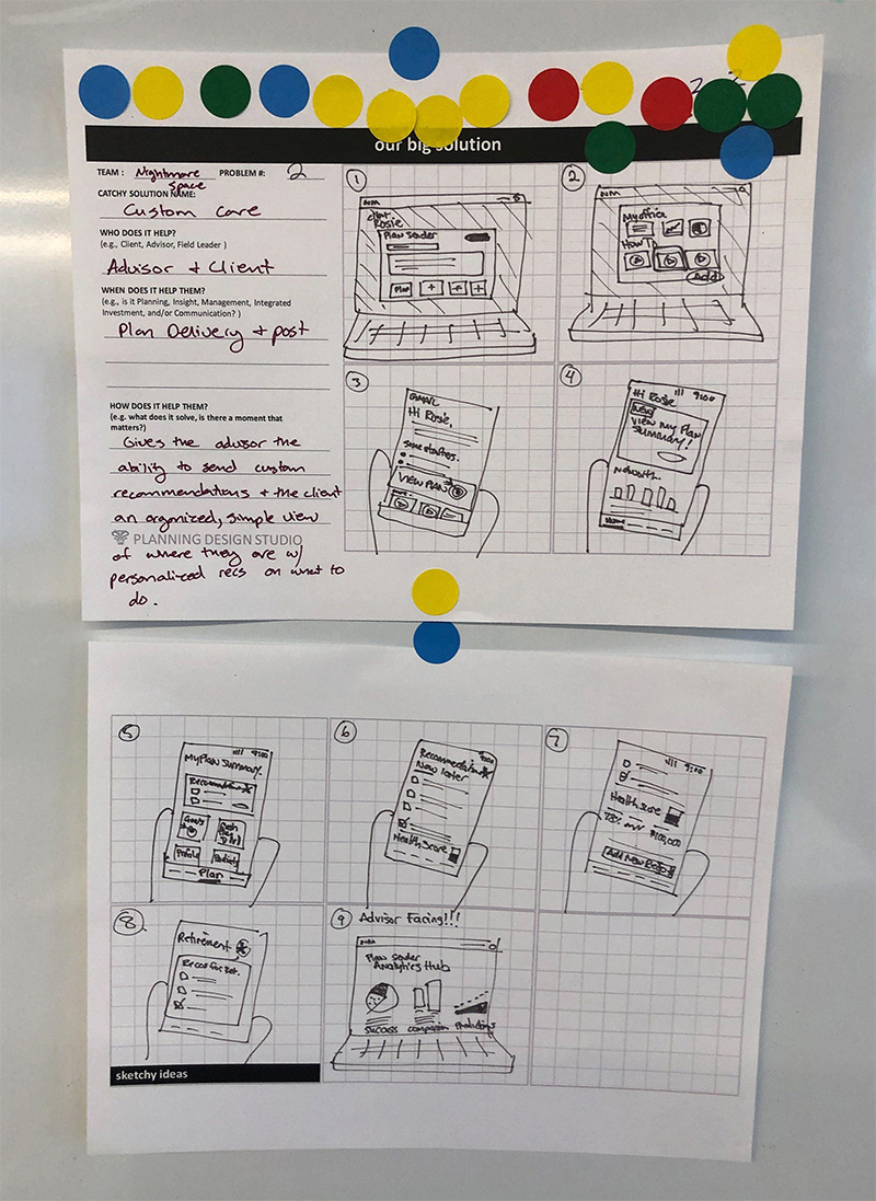
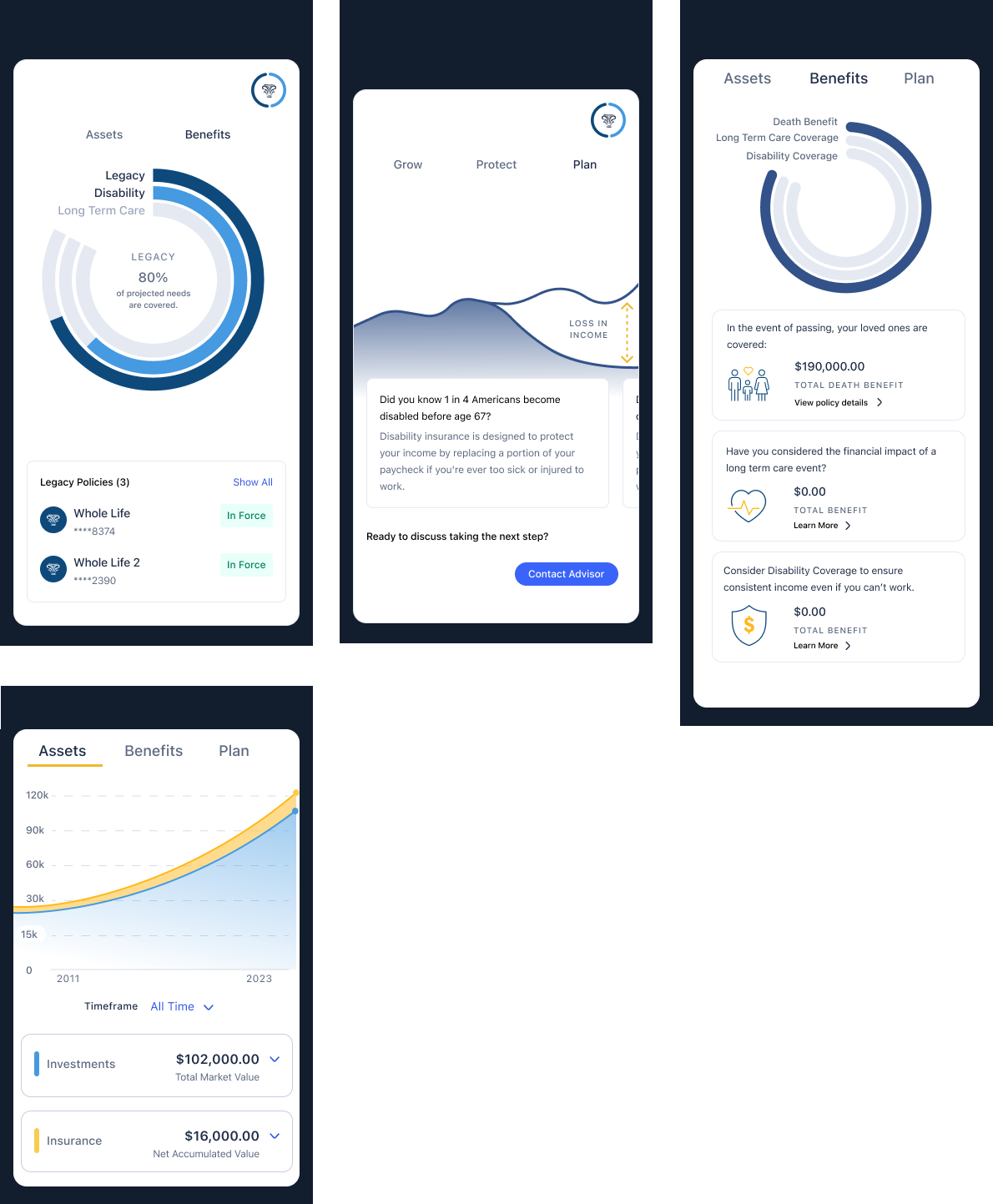
Once it was time to get stakeholder and user feedback, the visual fidelity increased but the content fidelity remained low as the team conducted UX research to identify:
- hierarchy
- labels
- navigation patterns
- data visualization style
- overall branding
Ship, Learn, Iterate
The first iteration of the hero module, quick actions and design language updates shipped January 2024.
My role was Product Design Director overseeing the two workstreams.
Vision Team
- Gloria Wu, Designer
- Jarret Pickens, Designer
- Laura Levisay, Designer
- Kathryn Marinaro, Creative Director
Delivery Team
- Lindsay Ackerman, Senior Designer
- Bridget Ma, Associate Designer
- Joe McNeil, Principal Designer
- Thomas Voss, Content Design Director
.png)
